Getting Started with Web Accessibility: Tips and Best Practices
Web accessibility is crucial for ensuring that everyone, regardless of their abilities, can access and use the internet. By following best practices for accessibility, you can make your website more inclusive and user-friendly for all visitors. In this article, we'll explore the importance of accessibility and provide tips and guidelines for implementing accessibility best practices on your website. Whether you're just starting out with web accessibility or looking to improve your current efforts, these resources will help you create an accessible and enjoyable experience for all users.
What is web accessibility and why is it important?
Web accessibility refers to the practice of making websites and web applications usable by people of all abilities and disabilities. This includes those who may use assistive technologies, such as screen readers or keyboard-only navigation, as well as those with temporary or permanent disabilities, such as vision impairment or mobility issues.
Ensuring that your website is accessible has several benefits. First and foremost, it allows everyone to have equal access to information and services on the web. This is important not only from a moral standpoint, but also from a legal perspective. In many countries, there are laws and regulations that require websites to be accessible to people with disabilities.
In addition to being the right thing to do, making your website accessible can also have practical benefits for your business or organization. By designing your website with accessibility in mind, you can potentially reach a wider audience and increase your customer base. Accessibility can also improve the overall user experience for all visitors to your site, as it makes it easier to use and navigate.
Finally, investing in web accessibility can also help to improve your search engine optimization (SEO) and increase your website's visibility online. Search engines like Google consider accessibility as a ranking factor, so a more accessible website is more likely to rank higher in search results.

Understanding web accessibility guidelines and standards
Web accessibility refers to the practice of making websites and web applications usable by people with disabilities. There are various guidelines and standards that have been developed to help ensure that websites are accessible to users with disabilities.
One of the most widely recognized guidelines is the Web Content Accessibility Guidelines (WCAG), developed by the World Wide Web Consortium (W3C). WCAG consists of a set of recommendations for making web content more accessible to people with disabilities, including visual, auditory, physical, speech, cognitive, and neurological impairments.
WCAG is organized into four principles: perceivable, operable, understandable, and robust. These principles cover a wide range of accessibility issues, including the use of alternative text for images, the provision of captions and transcripts for audio and video content, and the use of clear and simple language.
WCAG also includes specific success criteria that websites must meet in order to be considered accessible. There are three levels of conformance: A, AA, and AAA. Level A represents the minimum level of accessibility, while level AAA represents the highest level of accessibility.
It is important for website owners and developers to understand and follow web accessibility guidelines and standards in order to ensure that their websites are accessible to as many users as possible.
How to make your website more accessible
Web accessibility refers to the practice of making websites and web applications usable by people with disabilities. This includes individuals who are blind or visually impaired, deaf or hard of hearing, mobility impaired, and those with cognitive or learning disabilities.
There are several ways you can make your website more accessible:
- Use proper headings and structure: Use heading tags (H1-H6) to mark up the hierarchy of your content and make it easier for screen reader users to navigate.
- Provide alt text for images: Alt text (short for alternative text) is a description of an image that is displayed if the image cannot be seen. Alt text is important for users who are blind or visually impaired, as it allows them to understand the content of the image.
- Use descriptive link text: Make it clear where a link will take users by using descriptive link text. Avoid using "click here" or "read more" as the link text, as these phrases do not provide any context.
- Make sure your website is easy to navigate: Use clear and descriptive page titles and provide a clear hierarchy of information. Use lists, headings, and other formatting techniques to make your content easy to scan.
- Use color contrast: Make sure the text and background colors on your website have sufficient contrast. This is important for users who are colorblind or have low vision.
- Test your website: Use tools like a screen reader or a keyboard emulator to test your website and identify any accessibility issues. You can also use online tools to check for color contrast and other accessibility issues.
Tips for improving the accessibility of your website
Web accessibility is about making sure that everyone, including people with disabilities, can use and access your website. Here are some tips for improving the accessibility of your website:
- Use clear and simple language: Write in a way that is easy to understand for all users, including those with cognitive or learning disabilities. Avoid jargon and use plain language whenever possible.
- Use descriptive and meaningful link text: Links should clearly describe the content that they lead to. Avoid using "click here" or "read more" as link text.
- Add alt text to images: Alt text is a description of an image that is displayed when the image is not available or when a user is using a screen reader. Alt text helps people with visual impairments understand the content of the image.
- Use headings and lists: Use headings and lists to organize and structure your content. This helps users with cognitive disabilities and screen reader users better understand and navigate your website.
- Design for keyboard accessibility: Make sure that all users, including those who use a keyboard or assistive technology, can access all functions and features of your website.
- Test your website: Use tools and resources to test the accessibility of your website and identify any issues that need to be addressed.
Best practices for designing and developing accessible websites
Designing and developing websites with accessibility in mind is crucial for ensuring that all users, including those with disabilities, can easily access and interact with your site. Here are some best practices to keep in mind when creating an accessible website:
- Use clear and simple language: Avoid using jargon and make sure that your content is easy to understand.
- Use headings and subheadings: These help users navigate the page and understand the structure of your content.
- Use descriptive alt text for images: Alt text is displayed in place of an image if it cannot be displayed, and it should accurately describe the content of the image.
- Choose color combinations carefully: Avoid using colors that have low contrast, as this can make it difficult for users with visual impairments to read the text.
- Use keyboard-accessible elements: Make sure that users can interact with your site using only a keyboard, as some users may not be able to use a mouse.
- Test your website for accessibility: Use tools like the WAVE Web Accessibility Evaluation Tool to check for any issues and make sure your site is fully accessible.
By following these best practices, you can create an accessible website that is easy to use for all users.
Tools and resources for testing and improving web accessibility
There are many tools and resources available that can help you test and improve the accessibility of your website. Some of the most useful ones include:
- Accessibility checkers: These tools scan your website and provide a report of any accessibility issues they find. Some popular options include the WebAIM WAVE, the axe browser extension, and the Chrome Lighthouse audit.
- User testing with assistive technologies: It's important to test your website using assistive technologies such as screen readers to see how they interact with your site. This can help you identify any issues that may not be apparent when using a traditional web browser.
- Web accessibility guidelines and standards: There are several guidelines and standards that provide recommendations for making websites more accessible. These include the Web Content Accessibility Guidelines (WCAG) and the Section 508 Standards. Familiarizing yourself with these guidelines can help you ensure that your website meets the necessary accessibility requirements.
- Training and education resources: There are many online resources and courses available that can teach you about web accessibility and how to implement best practices on your website. Some good places to start include the WebAIM website, the W3C Web Accessibility Initiative, and the International Association of Accessibility Professionals (IAAP).
By using these tools and resources, you can effectively test and improve the accessibility of your website, ensuring that it is accessible to users with disabilities and meets industry standards.
Conclusion: The benefits of making your website accessible
In conclusion, making your website accessible has a number of benefits for both your users and your business. By following accessibility best practices, you can ensure that your website is accessible to everyone, including users with disabilities. This can not only improve the user experience for a wider range of visitors, but also increase the potential reach and potential customer base for your business. In addition, making your website accessible can have SEO benefits, as search engines may prioritize sites that are more accessible in search results. Overall, implementing accessibility best practices on your website is a win-win situation that can benefit both your users and your business.
An Introduction to Responsive Web Design
In today's digital landscape, it's more important than ever for websites to be accessible and easy to use on a variety of devices. Enter responsive web design.

Photo de Balázs Kétyi sur Unsplash
What is responsive web design?
Responsive web design is a design approach that ensures that a website's layout and content adjusts seamlessly to the size and shape of the device on which it is being viewed. This means that whether a user is accessing a site on a desktop computer, a tablet, or a smartphone, the experience will be optimized for their particular device.
Responsive web design is a design approach that aims to provide an optimal viewing and interaction experience for users regardless of the device they are using to access a website. This is achieved through the use of fluid grids, responsive images, and media queries.
Fluid grids are a key principle of responsive design. They allow a website's layout to adjust and respond to the width of the device on which it is being viewed, rather than being fixed at a specific size. This ensures that the layout is consistent and easy to navigate on any device.
Responsive images are another important aspect of responsive design. These images automatically adjust their size to fit the width of the device, rather than being fixed at a specific size. This helps to prevent issues with images being too large or small for the device, which can negatively impact the user experience.
Media queries are a way to apply different styles to a website based on the characteristics of the device on which it is being viewed. This could include things like the screen size, resolution, or orientation. By using media queries, designers can create a website that looks and functions great on any device.
Together, these principles allow a website to adapt and respond to the size and shape of the device on which it is being viewed, providing a consistent and optimal experience for users.
The principles of responsive web design
There are a few key principles that underpin the practice of responsive web design. The first is the use of fluid grids, which allow a website's layout to expand or contract to fit the width of the device on which it is being viewed. The second is the use of responsive images, which automatically adjust their size to fit the width of the device, rather than being fixed at a specific size. And the third is the use of media queries, which allow designers to specify different styles for different screen sizes and resolutions.
Fluid grids
Fluid grids are an essential component of responsive design. They allow a website's layout to adjust and respond to the width of the device on which it is being viewed, rather than being fixed at a specific size. This ensures that the layout is consistent and easy to navigate on any device.
To create a fluid grid, designers typically use a grid system that is based on a series of columns and rows. The columns are defined using percentages, rather than fixed pixels, which allows them to expand or contract to fit the width of the device. The rows are defined using fixed pixels, which ensures that the content within each row remains consistent regardless of the device.
Here is an example of how a fluid grid might be implemented in CSS:
.container {
  max-width: 1200px;
  margin: 0 auto;
}

.column {
  float: left;
  width: 25%;
  padding: 0 10px;
}

@media (max-width: 600px) {
  .column {
    width: 50%;
  }
}
In this example, the .container class is used to create a container element with a maximum width of 1200 pixels and centered on the page. The .column class is used to create a series of columns that are 25% of the width of the container. The @media rule is used to specify a different width for the columns when the device's screen width is less than 600 pixels. This allows the layout to adjust and respond to different screen sizes.
Media Queries
Media queries are another important principle of responsive design. They allow designers to apply different styles to a website based on the characteristics of the device on which it is being viewed. This could include things like the screen size, resolution, or orientation. By using media queries, designers can create a website that looks and functions great on any device.
Here is an example of how a media query might be implemented in CSS:
@media (min-width: 600px) {
  .header {
    display: flex;
  }
}

@media (max-width: 600px) {
  .header {
    display: block;
  }
}
In this example, the @media rule is used to specify two different styles for the .header class. When the device's screen width is greater than 600 pixels, the .header element is displayed as a flex container. When the screen width is less than 600 pixels, the .header element is displayed as a block element. This allows the layout to adjust and respond to different screen sizes.
The benefits of using a responsive design approach
There are many benefits to using a responsive design approach. For one, it helps to improve the user experience by ensuring that a website is easy to navigate and use on any device. This can lead to increased engagement, higher conversion rates, and ultimately, more satisfied users. Additionally, with the proliferation of mobile devices, it's increasingly important for businesses to have a mobile-friendly website in order to reach and retain customers. And finally, using a responsive design approach can save time and resources, as it eliminates the need to create separate versions of a website for different devices.
One of the key benefits of responsive design is improved user experience. By ensuring that a website is easy to use and navigate on any device, businesses can increase engagement, conversion rates, and customer satisfaction. For example, a study by Google found that 61% of users are unlikely to return to a mobile site they had trouble accessing, and 40% visit a competitor's site instead. By using responsive design, businesses can avoid these issues and provide a better experience for their users.
Another benefit of responsive design is better reach and retention of customers. With the proliferation of mobile devices, it's increasingly important for businesses to have a mobile-friendly website in order to reach and retain customers. According to a study by ComScore, mobile devices account for nearly 65% of digital media time, and Google has stated that more searches are now done on mobile devices than on desktop computers. By using responsive design, businesses can ensure that their website is accessible and easy to use on any device, which can help to attract and retain customers.
In addition to these benefits, using a responsive design approach can also save time and resources. Rather than having to create and maintain separate versions of a website for different devices, businesses can use a single, responsive design that works on all devices. This can save time and resources that can be better spent on other aspects of the business.
There are many real-world examples of how responsive design has helped businesses achieve these benefits. For example, when the outdoor retailer REI redesigned its website using responsive design, it saw a 15% increase in mobile traffic and a 50% increase in online sales. Similarly, when the news and information website The Boston Globe redesigned its website using responsive design, it saw a 44% increase in mobile traffic and a 23% increase in ad revenues. These examples demonstrate the significant impact that responsive design can have on a business's bottom line.
In conclusion, the use of responsive design offers a range of benefits that can help businesses improve the user experience, reach and retain customers, and save time and resources. By using a responsive design approach, businesses can ensure that their website is accessible and easy to use on any device, which can help to drive engagement, conversion rates, and overall satisfaction.
Tools and techniques for implementing responsive design

Photo de Domenico Loia sur Unsplash
If you're a designer or developer looking to implement responsive web design on your own websites, there are a number of tools and techniques that you can use to get started. One popular tool is the CSS framework Bootstrap, which includes a range of pre-designed, responsive components that can be easily incorporated into a website. Other tools include the CSS preprocessor Less, and the design tool Sketch, which has built-in support for responsive design.
There are a number of tools and techniques that designers and developers can use to implement responsive design on their own websites. Some of the most popular options include CSS frameworks, CSS preprocessors, and design tools.
CSS
CSS frameworks are pre-designed, responsive frameworks that can be easily incorporated into a website. They typically include a range of components, such as grids, typography styles, and form elements, that can be used to build a website quickly and efficiently. Some popular CSS frameworks for responsive design include Bootstrap, Foundation, and Semantic UI.
CSS preprocessors are tools that allow designers to write more efficient and organized CSS code. They add features to CSS that are not natively supported, such as variables, mixins, and functions, which can make it easier to maintain and reuse code. Some popular CSS preprocessors for responsive design include Less and Sass.
Design Tools
Design tools are software applications that allow designers to create and prototype websites and interfaces. Many design tools now have built-in support for responsive design, which can make it easier for designers to create and test responsive layouts. Some popular design tools with responsive design features include Sketch, Adobe XD, and Figma.
When using these tools and techniques to implement responsive design, it's important to follow best practices to ensure that the final result is efficient, effective, and easy to maintain. Some tips for using these tools effectively include:
Mobile-first approach
Use a mobile-first approach, which means designing and building for smaller screens first and then scaling up to larger screens
Test and debug your responsive design on a variety of devices to ensure that it looks and functions as intended
Use design systems and style guides to maintain consistency and organization in your code
Keep your code clean and well-organized, using techniques like modularity and code reuse to make it easier to maintain and update
By following these best practices and using the right tools and techniques, designers and developers can create responsive websites that deliver a seamless and optimal experience for users on any device.
Best practices for creating a responsive website
Creating a responsive website involves more than just using the right tools and techniques. There are a number of best practices that designers and developers can follow to ensure that their responsive design is efficient, effective, and easy to maintain.
Testing and debugging
One important best practice is proper testing and debugging. It's important to test a responsive design on a variety of devices and screen sizes to ensure that it looks and functions as intended. This can involve using physical devices or emulators and simulators, and using tools like browser dev tools to inspect and troubleshoot the design. It's also important to pay attention to performance, ensuring that the website loads quickly and efficiently on any device.
Image optimization
Another best practice is optimizing images and other media for different devices. This can involve using techniques like compression, resizing, and using appropriate file formats to ensure that images and other media load quickly and efficiently on any device. It's also important to consider the impact of images and other media on performance, and to use techniques like lazy loading to improve the overall performance of the website.
Accessibility
In addition to these best practices, it's also important to consider the accessibility of a responsive website. This means ensuring that the website is easy to use and navigate for users with disabilities, and that it meets the relevant accessibility guidelines and standards. This can involve using techniques like proper heading structure, alt text for images, and descriptive link text to ensure that the website is accessible to all users.
Conclusion
By following these best practices and optimizing a responsive website for performance and accessibility, designers and developers can create websites that deliver a seamless and optimal experience for users on any device.
Other best practices for creating a responsive website include:
- Using a design system or style guide to ensure consistency and organization in the design and code
- Using modular, reusable code to make it easier to maintain and update the website
- Ensuring that the website is mobile-friendly and provides a good user experience on small screens
- Implementing responsive design early in the design process, rather than as an afterthought
- Using responsive design techniques like fluid grids, responsive images, and media queries to create a website that adjusts and responds to different devices
- Using tools and techniques like browser dev tools, emulators and simulators, and performance testing to debug and optimize the website
By following these best practices, designers and developers can create responsive websites that are efficient, effective, and easy to maintain, and that deliver a seamless and optimal experience for users on any device.
Case studies of successful responsive design projects
Responsive design has been widely adopted by businesses and organizations of all sizes and industries, and there are many successful case studies that demonstrate the impact that it can have.
One example is the outdoor retailer REI, which redesigned its website using responsive design in 2012. The new website saw a 15% increase in mobile traffic and a 50% increase in online sales, demonstrating the benefits of providing a seamless and optimized experience for users on any device.
Another example is The Boston Globe, which redesigned its website using responsive design in 2011. The new website saw a 44% increase in mobile traffic and a 23% increase in ad revenues, highlighting the importance of having a mobile-friendly website to reach and retain customers.
Other successful case studies of responsive design include the travel website Expedia, which saw a 12% increase in bookings after implementing responsive design, and the healthcare provider Kaiser Permanente, which saw a 50% increase in mobile traffic and a 38% increase in online appointment bookings after redesigning its website using responsive design.
These case studies demonstrate the significant impact that responsive design can have on a business's bottom line. By providing a seamless and optimized experience for users on any device, businesses can increase engagement, conversion rates, and customer satisfaction, and drive overall success.
In conclusion, responsive design has been widely adopted by businesses and organizations of all sizes and industries, and there are many successful case studies that demonstrate its impact. By providing a seamless and optimized experience for users on any device, businesses can drive engagement, conversion rates, and customer satisfaction, and achieve overall success.
Other successful case studies of responsive design include:
- The online retailer Zara, which saw a 20% increase in mobile sales after redesigning its website using responsive design
- The news and information website The Huffington Post, which saw a 25% increase in traffic from mobile devices after implementing responsive design
- The fashion retailer ASOS, which saw a 20% increase in mobile traffic and a 10% increase in conversion rates after redesigning its website using responsive design
These case studies illustrate the wide range of industries and businesses that can benefit from responsive design, and the specific challenges and solutions that can be involved in implementing it. By leveraging the principles of responsive design, businesses can create websites that deliver a seamless and optimized experience for users on any device, which can drive engagement, conversion rates, and overall success.
The future of responsive web design
Responsive web design is a field that is constantly evolving, with new trends and developments emerging all the time. Some of the current and emerging trends in the field include the increasing importance of design systems, the emergence of new technologies like 5G and the Internet of Things, and the role of artificial intelligence in web design.
Design Systems
Design systems have become an increasingly important trend in responsive web design. A design system is a set of design principles, guidelines, and reusable components that can be used to create a consistent and cohesive user experience across a range of products and platforms. By using a design system, businesses and organizations can ensure that their design and development efforts are aligned and efficient, and that their products and services provide a consistent and cohesive experience for users.
New technologies
New technologies like 5G and the Internet of Things (IoT) are also emerging as trends in responsive web design. 5G is a new generation of mobile networking technology that promises faster speeds, lower latency, and more capacity than previous generations. This will have significant implications for responsive design, as it will enable websites to load faster and more efficiently on mobile devices. The IoT is a network of devices that are connected to the internet and can communicate with each other. This will also have implications for responsive design, as it will enable designers to create websites that are more interactive and responsive to user actions and inputs.
Artificial Intelligence
Artificial intelligence (AI) is another trend that is starting to emerge in the field of responsive web design. AI technologies like machine learning and natural language processing can be used to create more personalized and adaptive websites that can respond to user behavior and preferences in real-time. This can help businesses and organizations to create more targeted and engaging experiences for their users.
Conclusion
While these trends and developments present many opportunities for responsive web design, they also present some challenges. One challenge is the need to keep up with the rapid pace of change in the field, as new technologies and approaches emerge all the time. This can be particularly challenging for businesses and organizations that may have limited resources or expertise in web design. Another challenge is the need to balance the desire for innovation and new technologies with the need to provide a seamless and consistent user experience across a range of devices and platforms.
Despite these challenges, the future of responsive web design is bright. As more and more businesses and organizations adopt responsive design, the field is likely to continue to evolve and mature, with new trends and developments emerging all the time. By staying up-to-date with the latest trends and best practices, businesses and organizations can ensure that they are well-positioned to take advantage of the opportunities that responsive web design presents, and to create websites that deliver a seamless and optimal experience for users on any device.
Tips for getting started with responsive web design
If you're just starting to work with responsive design, you may be wondering where to begin. Here are some practical tips and advice to help you get started:
- Start by familiarizing yourself with the principles of responsive design, such as fluid grids, responsive images, and media queries. This will help you to understand how responsive design works and how it can be applied in practice.
- Choose the right tools and techniques for your project. This will depend on your goals, budget, and skill level, but some popular options include CSS frameworks like Bootstrap, preprocessors like Less, and design tools like Sketch.
- Use a mobile-first approach, which means designing and building for smaller screens first and then scaling up to larger screens. This can help you to create a seamless and consistent experience for users on any device.
- Test and debug your responsive design on a variety of devices and screen sizes to ensure that it looks and functions as intended. This can involve using physical devices or emulators and simulators, and using tools like browser dev tools to inspect and troubleshoot the design.
- Keep up-to-date with the latest best practices and trends in the field. This can involve reading industry blogs and publications, attending conferences and workshops, and networking with other designers and developers.
By following these tips and advice, you can get started with responsive design and create websites that deliver a seamless and optimal experience for users on any device.
Conclusion
In conclusion, responsive web design is a crucial aspect of modern web development, and one that is essential for creating websites that are accessible and easy to use on any device. By following the principles of fluid grids, responsive images, and media queries, and by using the right tools and techniques, designers and developers can create websites that deliver a seamless and optimal experience for users on any device.
10 Tips for Improving the Performance of Your Web Applications
Improving the performance of your web applications is essential for providing a good user experience and ensuring that your web pages load quickly and efficiently. In this article, we will discuss 10 tips for improving web application performance. From using a content delivery network (CDN) to serve static assets to optimizing images and implementing lazy loading, these tips will help you make your web application faster and more efficient. Follow these best practices to enhance the performance of your web applications and provide a better experience for your users.
Use a content delivery network (CDN) to serve static assets
A CDN is a network of servers located in different geographic locations that can serve the static assets (such as images, CSS, and JavaScript files) of your web application to users. By using a CDN, you can reduce the load time of your web pages because the assets will be served from a location closer to the user, rather than from a single location.
For example, if you have a web application with users located all around the world, you can use a CDN to serve the static assets of your application from servers located in different regions. This will ensure that the assets are delivered to users with lower latency and better performance.
Enable compression for text-based resources
Compressing resources with algorithms such as gzip or brotli can significantly reduce the size of the transferred data, resulting in faster loading times for your web pages.
You can enable gzip compression for your web server by adding the following code to your .htaccess file:
<IfModule mod_deflate.c>
  AddOutputFilterByType DEFLATE text/html text/css text/javascript
</IfModule>
Minimize the number of HTTP requests made by your web page
The number of HTTP requests made by a web page can have a significant impact on its loading time. To reduce the number of requests, you can combine files, use image sprites, and reduce the number of plugins.
Instead of using separate CSS files for each page of your web application, you can combine them into a single file to reduce the number of HTTP requests made by the page.
Use async or defer attributes on script tags
When a script tag is encountered during the rendering of a web page, the browser must stop rendering the page and execute the script before continuing. By using the async or defer attributes, you can prevent the script from blocking the rendering of the page and improve the performance of your web application.
To use the async attribute on a script tag, you can add it as follows:
<script src="script.js" async></script>
Optimize images
Properly sizing images and using image formats with good compression, such as JPEG and WebP, can significantly reduce the size of the transferred data and improve the loading time of your web pages.
To optimize an image for the web, you can use an image editing tool such as Photoshop or free online tools to resize it to the appropriate dimensions and save it in a format like JPEG or WebP.
Use a cache plugin or server-side caching
Caching stores frequently-used data in memory, allowing it to be quickly accessed without making a server request. This can significantly reduce the load time of your web pages by reducing the number of server requests.
You can use a cache plugin like W3 Total Cache for WordPress to cache the data of your web application.
Minimize the use of third-party scripts
Third-party scripts, such as those used for advertising or analytics, can significantly slow down the loading of your web pages. By minimizing their use, you can improve the performance of your web application.
If you are using a third-party script for analytics, you can consider using a lightweight alternative like GoSquared or Fathom.
Implement lazy loading
Lazy loading is a technique where content is only loaded when it is needed, rather than all at once when the page is first loaded. This can improve the performance of your web application by reducing the amount of data that needs to be transferred.
To implement lazy loading for images in a web application, you can use the following code:
<img src="image.jpg" data-src="image.jpg" class="lazy">

<script>
  function lazyLoad() {
    var images = document.querySelectorAll('.lazy');
    images.forEach(function(img) {
      if (img.offsetTop < window.innerHeight + window.pageYOffset) {
        img.src = img.dataset.src;
      }
    });
  }
  window.addEventListener('scroll', lazyLoad);
  window.addEventListener('resize', lazyLoad);
  window.addEventListener('load', lazyLoad);
</script>
In this example, the lazyLoad function is called whenever the user scrolls, resizes the window, or the page is loaded. It selects all images with the lazy class and sets the src attribute to the value of the data-src attribute if the image is within the viewport. This causes the image to be loaded only when it is visible to the user.
Use a performance monitoring tool
Performance monitoring tools can help you identify and fix issues with your web application, such as slow loading times or errors.
You can use tools like Google PageSpeed Insights or Pingdom to monitor the performance of your web application and get recommendations for improvement.
Regularly test the performance of your web application
It is important to regularly test the performance of your web application and make improvements as needed. This can help ensure that your web application is fast and responsive for your users.
You can use tools like WebPageTest or Lighthouse to test the performance of your web application and get specific recommendations for improvement. You can also use A/B testing to compare the performance of different versions of your web application and determine which performs best.
Comment savoir si une propriété spécifique existe sur un objet JavaScript ?
Quand nous travaillons avec les objets en JavaScript, il y a toujours un moment où nous nous demandons si une propriété spécifique existe ou non.
Cet article est ici pour vous montrer 3 moyens de vérifier si une propriété spécifique existe sur un objet.
Comment utiliser hasOwnProperty() method in JavaScript ?
La méthode hasOwnProperty() va vérifier si un objet contient une propriété directe et return true ou false si elle existe ou non.
Syntaxe
obj.hasOwnProperty("propertyName")
Exemple
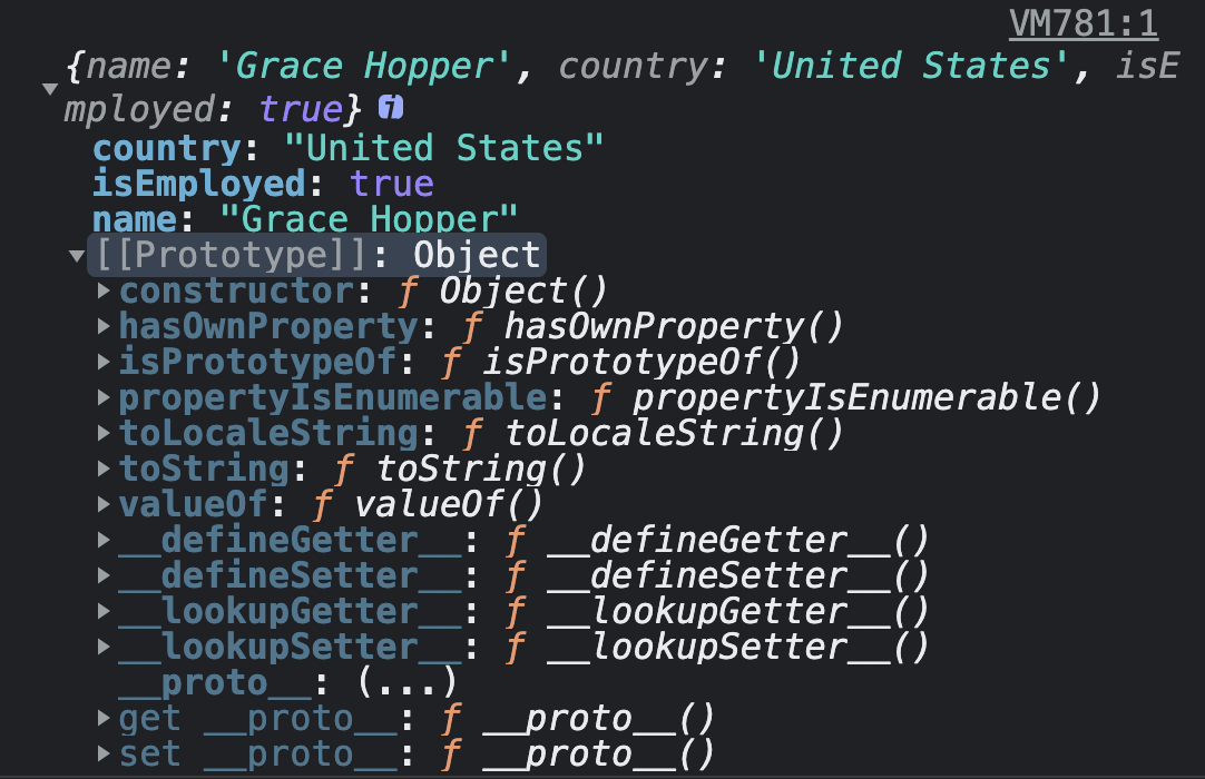
Comme premier exemple, nous avons un objet developer comme suit :
const developer = {
  name: "Grace Hopper",
  country: "United States",
  isEmployed: true // Damn girl, of course !
};

Si nous souhaitons vérifier si la propriété isEmployed existe dans notre objet, nous pouvons utiliser la méthode hasOwnProperty() comme ceci :
developer.hasOwnProperty("isEmployed")
Cela va retourner true parce que la propriété appelée isEmployed est une propriété directe de l'ojet developer.
Mais si nous essayons de vérifier la propriété appelée isPrototypeOf ?
developer.hasOwnProperty("isPrototypeOf")
Cela va retourner false pare qu'il n'y a aucune propriété directe appelée isPrototypeOf sur l'objet developer. Mais que signifie une propriété directe ?
Quand vous créez un objet en JavaScript, il y a toujours une "built-in" propriété appelée prototype et sa valeur est encore un autre objet. Cet objet aura également son propre prototype ; et c'est connu comment étant une prototype chain.
Notre objet developer a accès à ces autres propriétés, comme toString, et elles sont connues comme étant des inherited properties (Propriétés héritées/parents).
La Méthode hasOwnProperty() retournera uniquement true pour les pour propriétés directes contrairement aux propriétés héritées de la chaine de prototype.
Comment utiliser l'opérateur in
Contrairement à la méthode hasOwnProperty(), l’opérateur in retournera true pour les propriétés directes et Également pour les propriétés héritées qui existent dans l'objet.
Syntaxe
"propertyName" in object
Exemple
Par rapport a notre exemple plus haut, nous pouvons vérifier si la propriété country existe dans notre objet developer :
"country" in developer
Comme vous l'avez déjà deviné, cela va retourner true car c'est une propriété direte à l'objet. Maintenant essayer de vérifier la propriété toString :
"toString" in developer
Cel av aretourner true parce que la propriété toString existe dans la chaine de prototypage car c'est hérité de l'objet Prototype.
Comment Vérifier si une propriété existe sur un objet en utilisant undefined
Si vous essayez d’accéder une propriété qui n'existe pas dans l'objet, vous obtiendrez alors undefinied.
Nous pouvons vérifier si une propriété existe dans un objet en utilisant !== undefined.
Syntaxe
object.propertyName !== undefined
Exemple
Dans l'exemple ci-dessous, la valeur true sera retournée car la propriété name existe sur l'objet developer.
developer.name !== undefined
Conclusion
Si vous avez besoin de vérifier si une propriété existe dans un objet JavaScript, il y a 3 manières de le faire ;
- La méthode
hasOwnProperty() vérifiera si un objet a une propriété directe et retournera true ou false si elle existe ou non. Celle méthode dira si la propriété existe uniquement si elle est directe.
- Contrairement à la méthode
hasOwnProperty(), l’opérateur in retournera true ou false pour les propriétés directes ou héritées.
- Nous pouvons également vérifier si elle existe en utilisant
object.propertyName !== undefined.
J’espère avoir pu vous éclairer et que vous avez apprécier l'article. Hâte de vous revoir ! 👋
Créer un effet d’ombre au scroll en CSS pure
Quand j'ai découvert l'article de Lea Verou "Pure CSS scrolling shadows with background-attachment: local", je me suis écriée que cette femme est un génie ! Lorsque l'on pense à ce genre de détail, directement nous nous disons que c'est qu'en JavaScript. Pourtant, avec la propriété background-attachment: local, cela devient un jeu d'enfant.
Pour cet article, le but sera de réaliser ce petit CodePen où l'on peut observer une ombre en haut ou en bas, enfonction de votre position dans la lecture du texte.
See the Pen
Pure CSS Scrolling Shadows by Laura Durieux (@Lauwed)
on CodePen.
Un peu d'explications sur background-attachment
Lorsque nous étions à la version 2.1 du CSS, fixed et scroll étaient les deux seules valeurs disponibles pour la propriété background-attachment. scroll est la valeur par défaut et positionne l'image de fond relativement au bloc auquel il appartient. Tandis que fixed positionne l'image de fond relativement au viewport, ce qui fait que l'image reste fixe lors du scroll.
Avec l'arrivée de Backgrounds and Borders Level 3, une nouvelle valeur fait son entrée ; local. Quand background-attachment: local est appliqué, l'image de fond va être positionnée relativement à son parent, comme la valeur scroll, mais cette fois, le fond bougera lorsque l'on scroll son parent.
Voici un petit CodePen pour vous permettre de regarder la différence, ainsi que de pouvoir un peu chipoter.
See the Pen
background-attachment explanations by Laura Durieux (@Lauwed)
on CodePen.
Utilisation des multiples backgrounds et de background-attachment
Pour réussir a faire l'exemple, nous avons encore besoin d'une dernière notion ; Les multiple-backgrounds. Pour cela, il faut utiliser la propriété backgroundet non background-image et utiliser cette nomenclature.
.maClasse {
  background: background1, background2, ..., backgroundN;
}
Il faut savoir 2 choses ;
background1 sera le plus "haut" de la pile, donc le premier que nous verrons. backgroundN est donc le plus "bas" de la pile.- Seul le dernier background peut décrire une couleur.
J'ai réalisé un petit CodePen pour vous montrer comment nous allons utiliser background-attachment. Tout d'abord, nous avons 4 fonds différents ; 2 verts et 2 rouges.
background:
    /* Dégradés verts */
    radial-gradient(farthest-side at 50% 0, rgba(#2ecc71,1), rgba(#2ecc71,0)),
    radial-gradient(farthest-side at 50% 100%, rgba(#2ecc71,1), rgba(#2ecc71,0)) 0 100%,
    /* Dégradés rouges */
    linear-gradient(#e74c3c 30%, rgba(255,255,255,0)),
    linear-gradient(rgba(255,255,255,0), #e74c3c 70%) 0 100%;
Et comme nous pouvons le remarquer, les dégradés verts se trouvent bien au-dessus des dégradés rouges, vu qu'ils sont définis en premier.
Ensuite vient la fameuse propriété background-attachment qui a également 4 valeurs différentes, une pour chaque dégradés. Nous avons 4 images de fond, donc 4 valeurs pour cette propriété.
/* Opera doesn't support this in the shorthand */
background-attachment: scroll, scroll, local, local;
Les dégradés verts restent fixés lorsque nous scrollons le parent, tandis que les dégradés rouges se déplacent avec le scroll grâce à la valeur local.
Voici le petit CodePen.
See the Pen
Pure CSS Scrolling Shadows by Laura Durieux (@Lauwed)
on CodePen.
Réalisation du projet
Maintenant, nous avons toutes les clefs en main pour pouvoir réaliser aisément le projet. Nous pouvons reprendre l'exemple d'au-dessus, sauf que cette fois, il faut inverser l'ordre des images de fonds. En effet, les dégradés verts sont notre effet shadow qui doivent être cachés par les dégradés rouges qui seront blancs, lorsque nous scrollons tout haut ou tout en bas.
See the Pen
Pure CSS Scrolling Shadows by Laura Durieux (@Lauwed)
on CodePen.
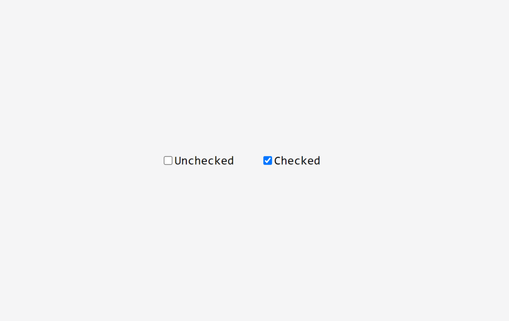
Customiser un input checkbox sans label
Avant de commencer
Première fois que vous vous attaquez à la personnalisation d'un input de type checkbox ? Je vous conseille de d'abord aller lire mon autre article :
Comme dans mon article précédant, le but de celui-ci sera de réussir à déveloper un input checkbox sans label visible avec seulement de l'HTML et du CSS tout en restant 100% accessible.
Voici le résultat final:
See the Pen
Checkbox without label by Laura Durieux (@Lauwed)
on CodePen.
Ce tutoriel se résume à :
- Côté HTML et accessibilité
- Casser l'apparence par défaut de l'input checkbox
- Personnaliser l'état checked de l'input checkbox
N'attendons plus et plongeons tête la première.
Côté HTML et accessibilité
La balise form
Commençons par créer notre HTML de base. Tout d'abord, qui dit balise input, dit balise form. Peu importe l'utilité de votre input, si vous en avez un, c'est qu'il y a une notion de formulaire. Même lorsque vous faites du shopping en ligne et que vous triez les articles en fonction de leur couleurs, c'est un formulaire.
Je vais donc commencer par créer mon formulaire.
<form action="/" method="GET" class="form">
</form>
Je spécifie les deux attributs action et method qui sont importants de connaître. Vous pouvez vous réferrer à la documentation MDN pour en savoir plus. J'ajoute également une classe form pour se mettre en situation le plus possible.
Création de l'input
Ok, première étape pour une bonne accessibilité. Maintenant, nous allons ajouter l'input et son label.
<form action="/" method="GET" class="form">
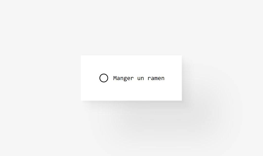
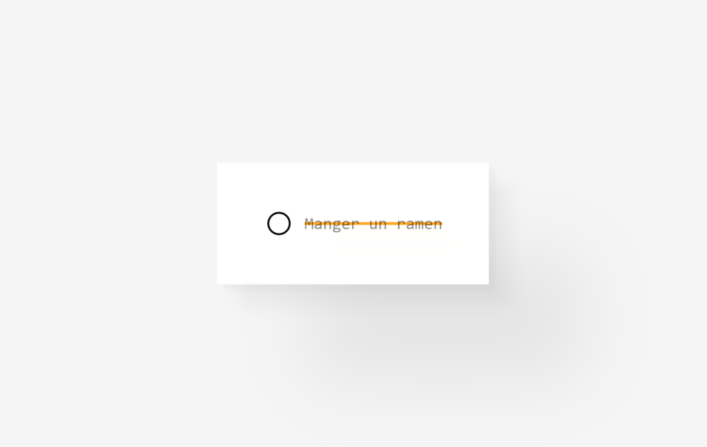
<input type="checkbox" name="todo" value="Manger un ramen" id="ramen">
<label for="ramen"><span>Manger un ramen</span></label>
</form>
Première chose ; Arrêtez de mettre la balise input dans la balise label. C'est un bon exemple de vouloir faire un effort niveau accessibilité, mais de ne pas correctement utiliser ses outils. Vous avez également remarqué que j'ai mis le label après l'input. Heureusement, grâce à lattribut value, le screen reader ira lire directement cette information. Du coup, que le label soit avant ou après la checkbox, la personne aura l'information lorsque il arrivera sur l'input checkbox.
Mais du coup, si je ne mets pas l'input dans le label, comment je fais pour les "lier" ? C'est ici que l'attribut for rentre en jeu. Vous pouvez remarquer que l'attribut id de l'input et l'attribut for du label on la même valeur. L'attribut for du label permet d'indiquer par l'ID à quel input il appartient. Maintenant, vous pouvez cibler un input même en cliquant sur son label.
Petit plus
Pour finir l'HTML, nous allons anticiper nos besoins pour le CSS en regroupant l'input et le label dans une div et lui donner une classe en respectant la convention de nommage BEM. Ici, le block, c'est le form et l'element, c'est l'item.
<form action="/" method="GET" class="form">
  <div class="form__item">
    <input type="checkbox" value="Manger un ramen" name="ramen" id="ramen">
    <label for="ramen"><span>Manger un ramen</span></label>
  </div>
</form>

Casser l'apparence par défaut de l'input checkbox
Le style par défaut et utilisation de appearance: none;
Par défault, l'apparence et l'état checkeddes inputs sont assez simples.
La propriété de base qui donne justement ce style par défaut, c'est appearance: auto; inclus dans la user agent stylesheet. Notre première étape sera donc de supprimer ce style par défault en enlevant l'apparence automatique en utilisant appearance: none;.
input {
    appearance: none;
}
Ajouter du style à l'input
Le résultat c'est... Rien ! Cette propriété enlève tous les styles par défault, ce qui veut dire que la checkbox n'est plus visible, car elle n'a plus de largueur, hauteur, bord, .. définis !
Très bien, maintenant nous allons parler stratégie. Le but ici, c'est de seulement avoir le visuel d'un input checkbox et ne même plus avoir de texte. La première pensée logique serait de faire dispiraître le labele et de ne changer l'apparence que de l'input. Or, ce n'est pas la bonne manière de procéder. Pourquoi ? Car comme vous allez le voir, nous allons utiliser un pseudo-element ; ::before et ce n'est pas possible de l'utiliser sur un élément de type input, car celui est une balise auto-fermante et ne permet la création de pseudo-element. Donc, au lieu de créer une 45ème balise div, nous allons utiliser la balise label sur laquelle nous pouvons faire tout ça.
Autant dans le précédent tutoriel, ça nous arrangeais pas la propriété appearance: none;, autant ici ça nous arrange. Elle nous permet de nous débarraser visuellement de la checkbox sans l'enlever du DOM, elle reste donc complètement accessible.
Une autre technique, aurait été d'enlever la propriété ... et d'appliquer ce snippet de style à l'input pour cacher cet élément visuellement, sans le détacher du DOM pour qu'il reste accessible pour les screen readers.
clip: rect(0 0 0 0);
clip-path: inset(50%);
height: 1px;
overflow: hidden;
position: absolute;
white-space: nowrap;
width: 1px;
Pour plus d'informations, n'hésitez pas à aller sur l'article de a11y, Hide content.
Par conséquent, ce sous-titre est mensongé et je vous propose de passer au suivant.
Ajouter du style au label
Maintenant que l'input est visuellement caché, nous allons nous attaquer au label. Comme style, j'ai décidé du Neumorphism, même si cette tendance est très déconseillée car elle est très pauvre en contraste et est très peu accessible pour les gens qui ont des déficiences visuelles. Je vous conseille d'aller lire ces petits articles pour plus comprendre la problématique autant de cette tendance :
label {
    /* Important, cela nous permettra de centrer l'icône à l'intérieur. */
    position: relative;
    /* Hauteur, largeur, ... */
    height: 70px;
    width: 70px;
    padding: 20px;
    /* Permet d'être un rond */
    border-radius: 50%;
    transition: 0.3s ease;
    /* Ce qui donne l'effet neomorphique */
    box-shadow: -2px -2px 5px rgba(white, 1), 2px 2px 5px rgba(black, 0.1);
    /* Pour cacher le texte du label */
    white-space: nowrap;
    text-indent: -2000%;
    overflow: hidden;
}
Il nous manque plus qu'à ajouter l'icône au milieu du cercle. Pour cela, je vais utiliser le pseudo-élément ::before, faire en sorte qu'il fasse la taille du label et après mettre mon icône en background. Il y a des milliards de faire différentes et la mienne n'est pas forcément la meilleure. J'ai récupérer l'icône sur le super site Iconmonstr.
label::before {
    /* Important et indispensable si vous voulez que votre pseudo-élément s'affiche */
    content: "";
    width: 100%;
    height: 100%;
    background-image: url("data:image/svg+xml;base64,PHN2ZyB3aWR0aD0iMjQiIGhlaWdodD0iMjQiIHhtbG5zPSJodHRwOi8vd3d3LnczLm9yZy8yMDAwL3N2ZyIgZmlsbC1ydWxlPSJldmVub2RkIiBjbGlwLXJ1bGU9ImV2ZW5vZGQiPjxwYXRoIGQ9Ik0xOCAyNGgtMTJsLTIuNDA0LTEzLjg5OWMtLjYgMS4wODctMS4yODggMi4zMzYtMS43MDQgMy4wOTUtLjQ5Ni45MDctMS44OTIuNTUxLTEuODkyLS40OCAwLS4xNjIuMDU0LS4zMjcuMTM3LS40OC44MjgtMS41MTQgMi43MzctNC45NjMgMi44OC01LjIyMWwtLjAwMi0uMDE1aDkuOTI0bDEuNjIzLTYuMjU5Yy4xMi0uNDQ3LjUyNC0uNzQxLjk2NS0uNzQxLjY1MSAwIDEuMTM5LjYxOS45NjggMS4yNTlsLTEuNDg1IDUuNzQxaC4zOThsNC4xOTktNS41N2MuMzE3LS40NTMuOTQxLS41NjMgMS4zOTMtLjI0Ni40NTIuMzE2LjU2Mi45NDEuMjQ2IDEuMzkzbC0zLjM5NyA0LjQyM2gzLjE2NmwtLjAwNy4wMzZjLjIxMi4zODIgMi4wNTkgMy43MTggMi44NjkgNS4yLjA4My4xNTMuMTIzLjMxOC4xMjMuNDggMCAxLjAzNi0xLjM4NCAxLjM4NC0xLjg3OC40OC0uNDEzLS43NTYtMS4wOTUtMS45OTItMS42OTMtMy4wNzRsLTIuNDI5IDEzLjg3OHptLTIuNDctOGgtNy4wM2wtMi4zOTEtMy4zNDcgMS41NjUgOS4zNDdoOC42ODFsMS41NjUtOS4zNDctMi4zOSAzLjM0N3ptMi41NDItN2gtMTIuMTE0bDMuNTcxIDVoNC45NzFsMy41NzItNXptLTQuMDU3IDIuNWMwLS4yNzYtLjIyNC0uNS0uNS0uNWgtM2MtLjI3NiAwLS41LjIyNC0uNS41IDAgLjI3NS4yMjQuNS41LjVoM2MuMjc2IDAgLjUtLjIyNS41LS41Ii8+PC9zdmc+");
    background-position: center;
    background-size: 50px;
    background-repeat: no-repeat;
    /* Pour centrer l'icône */
    position: absolute;
    left: 0;
    top: 0;
    transition: background 0.3s ease;
}
Personnaliser l'état checked de l'input checkbox
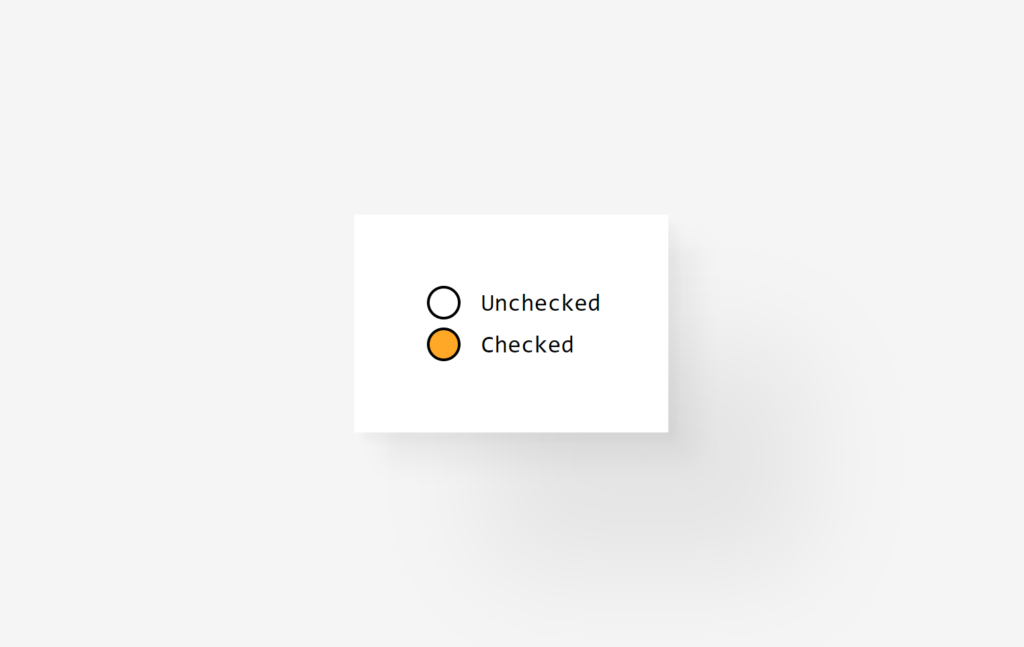
Nous avons le style de base de notre input. Pourtant, quand je clique sur mon "faux" bouton (car c'est un label), rien ne se passe. Il nous faut encore définir le style pour l'état :checked de l'input. faison cela sans attendre.
input:checked + label {
  outline: none;
  cursor: pointer;
  transition: 0.2s ease-in-out;
  box-shadow: inset -2px -2px 5px white, inset 2px 2px 5px rgba(0, 0, 0, 0.1);
}
input:checked + label::before {
  background-image: url("data:image/svg+xml;base64,PHN2ZyB3aWR0aD0iMjQiIGhlaWdodD0iMjQiIHhtbG5zPSJodHRwOi8vd3d3LnczLm9yZy8yMDAwL3N2ZyIgZmlsbC1ydWxlPSJldmVub2RkIiBjbGlwLXJ1bGU9ImV2ZW5vZGQiPjxwYXRoIGQ9Ik0xOCAyMy45OTlsLTEyIC4wMDEtMS45ODMtMTEuNTc4LjYzNy0xLjEyMyAzLjY5MiA0LjE3MyA3LjI2NC4wMDMgMy43MjEtNC4yMTQuNjUyIDEuMTYtMS45ODMgMTEuNTc4em0tNS4wNzUtMTdsMS42MjItNi4yNThjLjEyLS40NDcuNTI0LS43NDEuOTY1LS43NDEuNjUxIDAgMS4xMzkuNjE4Ljk2OCAxLjI1OGwtMS40ODUgNS43NDFoLjM5OGw0LjIxNC01LjU3MWMuMzE3LS40NTIuOTQxLS41NjIgMS4zOTMtLjI0NS40NTIuMzE2LjU2Mi45NC4yNDYgMS4zOTJsLTMuNDEyIDQuNDI0aDMuMTY2bC0uMDA3LjAzNmMuMjEyLjM4MiAyLjA1OSAzLjcxOCAyLjg2OSA1LjIuMDgzLjE1My4xMzguMzE4LjEzOC40OCAwIDEuMDM2LTEuMzk5IDEuMzg0LTEuODkzLjQ4LS42MS0xLjExNS0xLjgwNi0zLjI3OS0yLjQ1MS00LjQ0NmwtNC42OCA1LjI1aC01Ljk2M2wtNC42NDItNS4zMjdjLS42MzQgMS4xNDYtMS44NyAzLjM4My0yLjQ5NCA0LjUyMy0uNDk1LjkwNy0xLjg3Ny41NTEtMS44NzctLjQ4IDAtLjE2Mi4wNC0uMzI3LjEyMy0uNDguODI4LTEuNTE0IDIuNzM3LTQuOTYyIDIuODgtNS4yMmwtLjAwMy0uMDE2aDkuOTI1em0xLjA3NSA0LjVjMC0uMjc2LS4yMjQtLjUtLjUtLjVoLTNjLS4yNzYgMC0uNS4yMjQtLjUuNXMuMjI0LjUuNS41aDNjLjI3NiAwIC41LS4yMjQuNS0uNSIvPjwvc3ZnPg==");
}
Conclusions
Félicitations !! Vous l'avez fait !
J'espère que ça vous aura aidé. J'essaye d'être la plus claire possible, mais je ne suis pas la meilleure écrivaine, donc je suis toujours ouverte aux feedbacks ouverts réspectueux.
N'hésitez pas à laisser un commentaire et de me supporter en m'achetant un café ✨

Ciao !
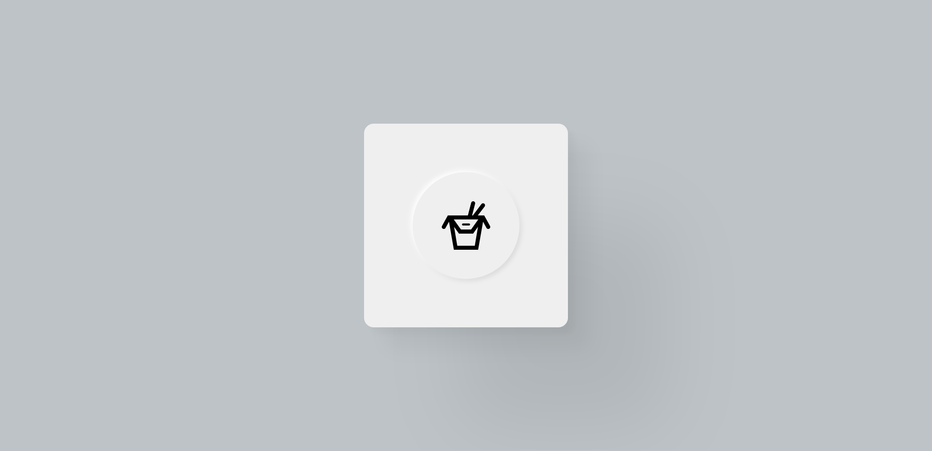
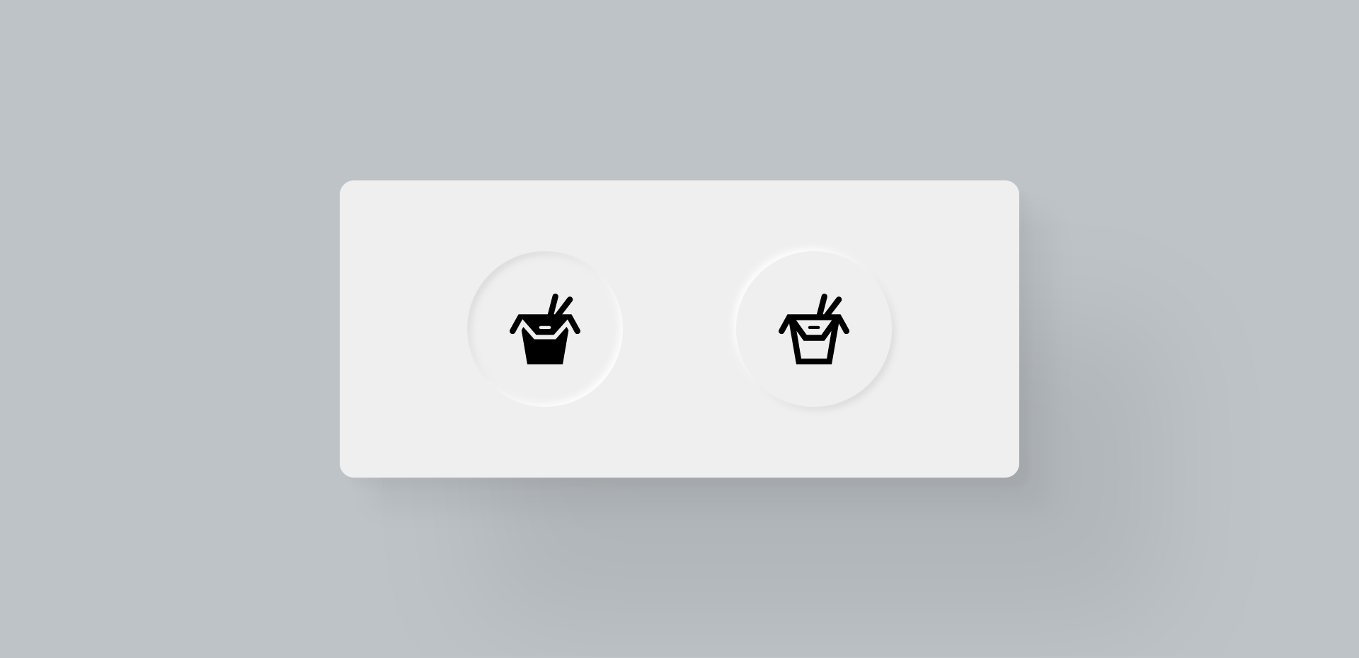
Customiser un input checkbox avec un label
Hello hello ! Le but de cet article est d'expliquer pas à pas comment customiser un input checkbox tout en gardant son label. Le plus important, c'est de réussir à jouer avec l'apparence de l'input tout en le laissant 100% accessible.
Voici l'input checkbox que nous allons réaliser dans cet article :
See the Pen
Untitled by Laura Durieux (@Lauwed)
on CodePen.
Voici les différentes étapes :
- Côté HTML et accessibilité
- Casser l'apparence par défaut de l'input checkbox
- Personnaliser l'état
checked de l'input checkbox
N'attendons plus et plongeons tête la première.
Côté HTML et accessibilité
La balise form
Commençons par créer notre HTML de base. Tout d'abord, qui dit balise input, dit balise form. Peu importe l'utilité de votre input, si vous en avez un, c'est qu'il y a une notion de formulaire. Même lorsque vous faites du shopping en ligne et que vous triez les articles en fonction de leur couleurs, c'est un formulaire.
Je vais donc commencer par créer mon formulaire.
<form action="/" method="GET" class="form">
</form>
Je spécifie les deux attributs action et method qui sont importants de connaître. Vous pouvez vous réferrer à la documentation MDN pour en savoir plus. J'ajoute également une classe form pour se mettre en situation le plus possible.
Création de l'input
Ok, première étape pour une bonne accessibilité. Maintenant, nous allons ajouter l'input et son label.
<form action="/" method="GET" class="form">
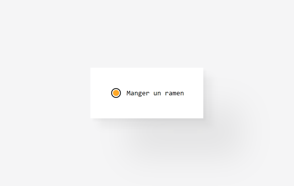
<input type="checkbox" name="todo" value="Manger un ramen" id="ramen">
<label for="ramen"><span>Manger un ramen</span></label>
</form>
Première chose ; Arrêtez de mettre la balise input dans la balise label. C'est un bon exemple de vouloir faire un effort niveau accessibilité, mais de ne pas correctement utiliser ses outils. Vous avez également remarqué que j'ai mis le label après l'input. Heureusement, grâce à lattribut value, le screen reader ira lire directement cette information. Du coup, que le label soit avant ou après la checkbox, la personne aura l'information lorsque il arrivera sur l'input checkbox.
Mais du coup, si je ne mets pas l'input dans le label, comment je fais pour les "lier" ? C'est ici que l'attribut for rentre en jeu. Vous pouvez remarquer que l'attribut id de l'input et l'attribut for du label on la même valeur. L'attribut for du label permet d'indiquer par l'ID à quel input il appartient. Maintenant, vous pouvez cibler un input même en cliquant sur son label.
Petit plus
Pour finir l'HTML, nous allons anticiper nos besoins pour le CSS en regroupant l'input et le label dans une div et lui donner une classe en respectant la convention de nommage BEM. Ici, le block, c'est le form et l'element, c'est l'item.
<form action="/" method="GET" class="form">
  <div class="form__item">
    <input type="checkbox" value="Manger un ramen" name="ramen" id="ramen">
    <label for="ramen"><span>Manger un ramen</span></label>
  </div>
</form>
Casser l'apparence par défaut de l'input checkbox
Le style par défaut et utilisation de appearance: none;
Par défault, l'apparence et l'état checkeddes inputs sont assez simples.
La propriété de base qui donne justement ce style par défaut, c'est appearance: auto; inclus dans la user agent stylesheet. Notre première étape sera donc de supprimer ce style par défault en enlevant l'apparence automatique en utilisant appearance: none;.
input {
    appearance: none;
}
Ajouter du style à l'input
Par contre, le résultat c'est... Rien ! Cette propriété enlève tous les styles par défault, ce qui veut dire que la checkbox n'est plus visible, car elle n'a plus de largueur, hauteur, bord, .. définis ! Il va donc falloir tout redéfinir manuellement en CSS.
Voici le style par défault de la checkbox :
input {
    /* Disable default style */
    appearance: none;
    /* Define the width and the height */
    width: 25px;
    height: 25px;
    /* Space between the input and the label */
    margin-right: 15px;
    /* Custom appearance */
    border-radius: 50%;
    border: 2px solid black;
}
J'ai également ajouté un peu de style à la div qui groupe le label et l'input pour qu'ils soient centrés verticalement.
.form__item {
    display: flex;
    align-items: center;
}
Personnaliser l'état checked de l'input checkbox
En créant notre checkbox, nous avons fait attention à l'accessibilité, ensuite à correctement enlever le style par default et mettre le notre. Le problème suivant, c'est l'état checked de l'input. Vu que nous utilisons appearance: none;, lorsque vous cliquez sur l'input, il n'y a rien qui se passe visuellement. Nous allons donc devoir reprogrammer tout cela.
L'état checked d'un input en CSS
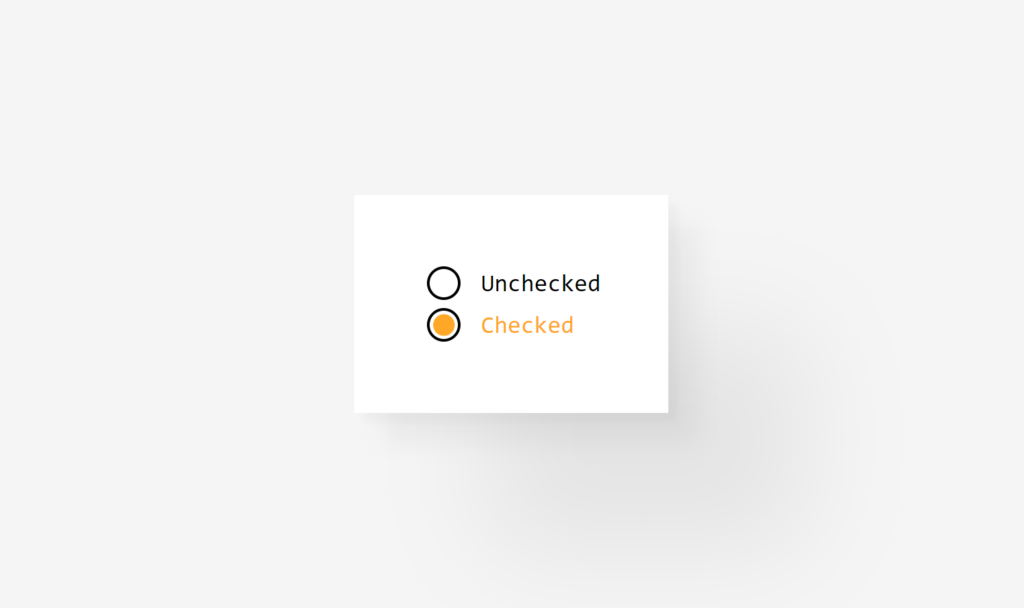
En CSS, il est possible de cibler l'état d'un élément grâce à un pseudo-sélecteur. En fonction de la balise HTML, différents pseudo-sélecteur sont disponibles. Vous connaissez sûrement déjà hover, focus ou encore visited pour les liens. Pour les inputs checkbox et radio, il existe un pseudo-sélecteur checked. Utilisons-le de suite ;
input:checked {
    background-color: #ffa726;
}
Du coup, maintenant que la checkbox est checked, ça va donner ceci ;
Style de la checkbox checked en utilisant les pseudo-éléments
Bon, c'est bien beau, mais c'est pas ça que nous voulons faire comme effet lorsque la checkbox est checked. Nous aimerions qu'il y ait une boule orange qui apparaisse au centre de la checkbox. Cette boule, nous allons utiliser un pseudo-élément CSS pour la créer. Commençons pas la créer comme si elle est là par défault.
.form__item input {
    appearance: none;
    border-radius: 50%;
    border: 2px solid black;
    width: 25px;
    height: 25px;
    margin-right: 15px;
    /* Add relative position to center the bullet to the input and not the body */
    position: relative;
}
.form__item input::before {
    /* Mandatory to create a pseudo element, even if the content is empty */
    content: "";
    /* To be able to position the bullet at the center of the input */
    position: absolute;
    /* Centering the bullet */
    top: 50%;
    left: 50%;
    transform: translate(-50%, -50%);
    /* Width and height relative to the size of the input */
    width: 75%;
    height: 75%;
    /* Custom style */
    border-radius: 50%;
    background: #ffa726;
}
Maintenant, nous allons utiliser la propriété transform pour faire apparaître la boule et la propriété transition pour donner un effet d'animation lorsque l'input change d'état.
.form__item input::before {
    /* ... */
    /* Scale to 0, like that the bullet is visually hidden */
    transform: translate(-50%, -50%) scale(0);
    /* Transition effect on the transform property */
    transition: transform .3s ease;
}
La boule devient invisible, car elle a été redimmensionnée à 0. Le pseudo-élément existe toujours, mais plus visuellement. Le but maintenant va de réussir à cibler le pseudo-élément lorsque la checkbox est checked. Pour cela, rien de plus simple, il faut d'abord cibler l'état de l'élément parent, puis indiquer le pseudo-élément ou psudo-sélecteur souhaité.
input:checked::before {
    /* Your code here */
}
Allons-y. Voici le code besoin pour faire réapparaître la boule lorsque la checkbox est checked.
input:checked::before {
    transform: translate(-50%, -50%) scale(1);
}
Personnaliser le label d'une checkbox checked
Pour pouvoir faire cela, il faut connaître le sélecteur css +. Ce que nous allons faire, c'est cibler le label, qui est le voisin direct de la chebox, quadn celle-ci est checked.
input:checked + label {
    color: #ffa726;
}
Style du label de la checkbox checked en utilisant les pseudo-éléments
Comme pour la chebox, nous allons utiliser un pseudo-élément pour créer la barre qui se retrouve sur le label lorsque la checkbox est checked. Nous allons commencer par raproduire ce style par défault, sans tenir compte de l'état de la checkbox.
Voici le style dont nous avons besoin :
.form__item label {
    /* Will help to position the pseudo-element */
    position: relative;
}
.form__item label span {
    /* Prevent user to select the text */
    user-select: none;
    /* Custom style */
    opacity: 0.5;
}
.form__item label::before {
    /* Mandatory to create a pseudo element, even if the content is empty */
    content: "";
    /* To be able to position the bar at the center vertically of the label */
    position: absolute;
    /* Positionning the bar */
    left: 0;
    top: 50%;
    /* Width relative to the size of the label */
    width: 100%;
    height: 3px;
    /* Custom style */
    background-color: #ffa726;
    transform: translateY(-50%);
}
Comme pour la boule, nous voulons que ça soit l'état uniquement quand la checkbox est checked. Voici les modifications que nous devons apporter au label pour son style de base :
.form__item label span {
    /* ... */
    /* Custom style */
    opacity: 1;
    /* Transition effect on the opacity */
    transition: opacity .3s ease;
}
.form__item label::before {
    /* ... */
    /* Adding the transformation scaleX to have the horizontal appearing animation */
    transform: translateY(-50%) scaleX(0);
    /* The origin of the transformation. Like that the bar appears from the left to the right */
    transform-origin: left center;
    /* Transition effect on the transformation */
    transition: transform .3s ease;
}
Je vous conseille d'aller lire un peu sur la propriété transform-origin qui peut bien sauver des vies de temps en temps. Ensuite, nous devons ajouter un peu de style lorsque la checkbox est checked.
.form__item input:checked + label span {
    opacity: 0.5;
}
.form__item input:checked + label::before {
    transform: translateY(-50%) scaleX(1);
}
Et voilà !
Merci beaucoup d'avoir lu cet article ! Je l'ai rédigé avec beaucoup de bonne humeur et j'espère avoir pu aider quelques âmes perdues.
N'hésitez pas à laisser un commentaire et de me supporter en m'achetant un café ✨
Ciao !
Use of the while loop with SQL
A little reminder of how to use while loop with SQL. End because everytime I forgot how to use it in SQL, I wanted to mark the occasion pour myself 👩💻
Basic structure
Official documentation
DECLARE @Count INT
SET @Count = 0

WHILE(@Count < 11) BEGIN
  PRINT 'I have walked ' + CONVERT(VARCHAR, @Count) + ' meters today'
  SET @Count = @Count + 1
END
The output is
I have walked 0 meters today
I have walked 1 meters today
I have walked 2 meters today
I have walked 3 meters today
I have walked 4 meters today
I have walked 5 meters today
I have walked 6 meters today
I have walked 7 meters today
I have walked 8 meters today
I have walked 9 meters today
I have walked 10 meters today
Using BREAK statement
DECLARE @Count INT
SET @Count = 0

WHILE(@Count < 11) BEGIN
  PRINT 'I have walked ' + CONVERT(VARCHAR, @Count) + ' meters today'

  IF @Count >= 7 BEGIN
    PRINT 'Finally, 7 meters is enough for today !'
    BREAK
  END

  SET @Count = @Count + 1
END
The output is
I have walked 0 meters today
I have walked 1 meters today
I have walked 2 meters today
I have walked 3 meters today
I have walked 4 meters today
I have walked 5 meters today
I have walked 6 meters today
I have walked 7 meters today
Finally, 7 meters is enough for today !
Using CONTINUE statement
DECLARE @Count INT
SET @Count = 0

PRINT 'Go get the multipliers of 3.'
WHILE(@Count < 11) BEGIN
  IF @Count % 3 > 0 BEGIN
    SET @Count = @Count + 1
    CONTINUE -- If @count is not a multiplier of 3, the loop continues
  END

  PRINT CONVERT(VARCHAR, @Count) + ' is a multiplier of 3.'

  SET @Count = @Count + 1
END
The output is
Go get the multipliers of 3.
0 is a multiplier of 3.
3 is a multiplier of 3.
6 is a multiplier of 3.
9 is a multiplier of 3.
The While loop and tables
Let's create a table that contains all the multipliers of 9.
Feed the table
DECLARE @Count INT
SET @Count = 1

DECLARE @Multipliers_nine TABLE
(Id INT PRIMARY KEY IDENTITY(1,1),
Value INT)

WHILE(@Count < 100) BEGIN
  IF @Count % 9 > 0 BEGIN
    SET @Count = @Count + 1
    CONTINUE -- If @count is not a multiplier of 9, the loop continues
  END

  -- Insert in the table @Multipliers_nine
  INSERT INTO @Multipliers_nine
  VALUES (@Count)

  SET @Count = @Count + 1
END

SELECT * FROM @Multipliers_nine
The output is
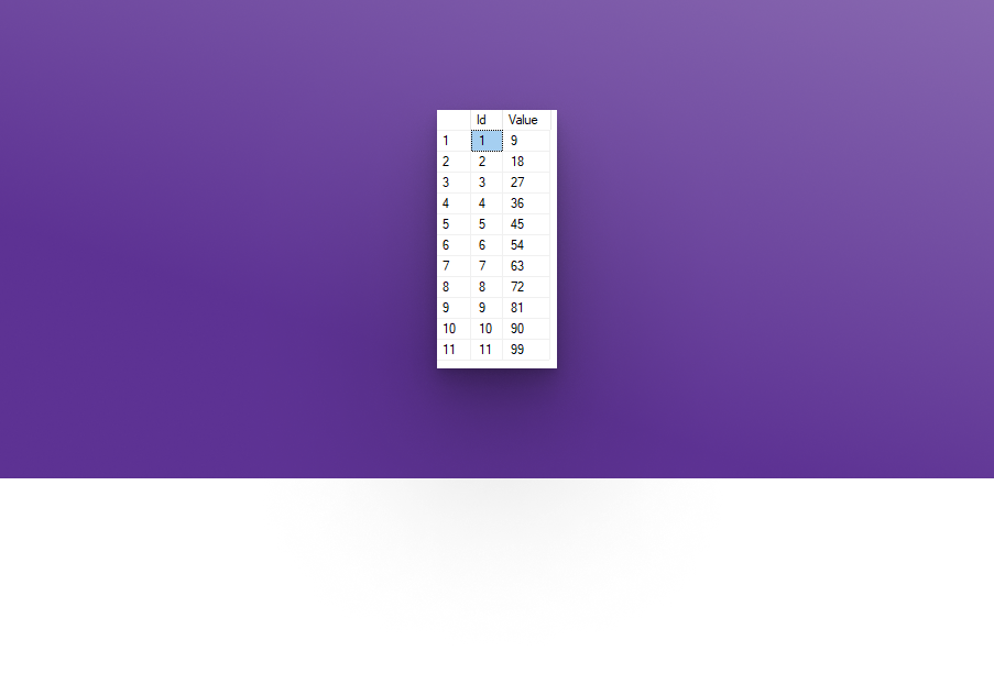
Get table values with the While Loop
DECLARE @Index INT, @MaxIndex INT, @Multiplier INT
SELECT @Index = min(Id), @MaxIndex = max(Id)
FROM @Multipliers_nine

WHILE(@Index IS NOT NULL AND @Index <= @MaxIndex) BEGIN
    SELECT @Multiplier = Value
    FROM @Multipliers_nine Where Id = @Index

    PRINT '9 x ' + CONVERT(VARCHAR, @Index) + ' = ' + CONVERT(VARCHAR, @Multiplier)
    SET @Index = @Index + 1
END
The output is
9 x 1 = 9
9 x 2 = 18
9 x 3 = 27
9 x 4 = 36
9 x 5 = 45
9 x 6 = 54
9 x 7 = 63
9 x 8 = 72
9 x 9 = 81
9 x 10 = 90
9 x 11 = 99
Conclusion of how to use while loop with SQL
This is really easy to use this structure in SQL and way faster to in term of table-manipulation. Prefer SQL over your programming language to manipulate a big range of data in tables. Why use stored procedure in SQL than queries ?
If you want to support me, you can always buy me a coffee.
Any question or comment ? Express yourself in the section down below, it would be a pleasure to answer them ✨
Have a great day!
How to get the difference between two DateTime in hour with C# ?
I am currently developing a mobile app with Xamrin.Forms and I had to know the difference between two DateTime in hours. It seems dumb, but in fact, it is quite tough to find a smart and optimised way to do it. I wanted to share with you the solution I found.
Basics
First, let's look at the basics.
DateTime.Substract(DateTime) lets us to substract the first date by the second one. It returns a TimeSpan value and it represents a time interval.TimeSpan is in fact, an instance that represents the difference between 2 DateTime objects. To learn more about this type, go here.TimeSpan.TotalHours is the property that interests us. It gets the value of the current TimeSpan structure expressed in whole and fractional hours and its value type is a double.- If you need the hour difference without a fraction of hours by using
TimeSpan.Hours property. It returns an int

Example
Here is a code snippet using this method to get the hour difference for training.
public int GetHourDifference(DateTime dateBefore, DateTime dateAfter)
{
  TimeSpan hourDifferenceSpan = dateAfter.Subtract(dateBefore);

  int hourDifference = hourDifferenceSpan.TotalHours;

  return hourDifference;
}

DateTime trainingBegin = DateTime.Today; // The training begins now
DateTime trainingEnd = DateTime.Today.AddHours(2);

Console.WriteLine("The training will last " + GerHourDifference(trainingBegin, trainingEnd) + " hours.");
Thank you so much for reading! I like to share all of those little tips! If you like it and it also interests you, please let me know in the comments! I can do these with JS, PHP, HTML and CSS. I will also try to create some little videos with tips like that. If you would like to see that, share it in the comments below. ✨
If you want to support me, you can always buy me a coffee.
Sources
How create hex colors in Xamarin.Forms in XAML ?
I was shocked, how long it took me to succeed in finding how to use the alpha layer in hexadecimal colors or hex colors in XAML. Well, turns out it is really simple.
Here is the official doc of Xamarin.Forms explaining how to use the hex colours in XAML.
<Label Text="Sea color" BackgroundColor="Aqua" />
<Label Text="RGB" BackgroundColor="#00FF00" />
<Label Text="Alpha plus RGB" BackgroundColor="#CC00FF00" />
<Label Text="Tiny RGB" BackgroundColor="#0F0" />
<Label Text="Tiny Alpha plus RGB" BackgroundColor="#C0F0" />
Pretty clear right? In fact, not at all. I come from the web world, so for me, when I use an alpha layer in a hex color it looks like this :
#RRGGBBAA // Where RR = red, GG = green, BB = blue and AA = alpha
The alpha layer is at the end of the hex. Note : the value of alpha is between 00 and 99. Turns out, the alpha layer in XAML is at the beginning. Here is the official doc, but with comments.
<Label Text="Sea color" BackgroundColor="Aqua" />
<Label Text="RGB" BackgroundColor="#CC00FF" />    <!-- #RRGGBB -->
<Label Text="Alpha plus RGB" BackgroundColor="#00CC00FF" />    <!-- #AARRGGBB -->
<Label Text="Tiny RGB" BackgroundColor="#CF0" /> <!-- #RGB -->
<Label Text="Tiny Alpha plus RGB" BackgroundColor="#0CF0" /> <!-- #ARGB -->
There is also another form of hex colours; scRGB formatted number. The format is sc#scA,scR,scG,scB where each value is between 0.0 to 1.0. I personally never tested it, but I wanted to share it with you all!
Thank you for reading! I hope you like it. If you have questions or if I said something wrong, don't hesitate to tell me in the comments! It is surprising sometimes how hex colors can have different formats depending of the language.
If you want to support me, you can always buy me a coffee.
Enjoy ✨
Sources